I have a hard time WANTING to learn as well as understanding story and web design. It is not something I am remotely interested in, but i understand it is good for me to learn. So I did my best to learn from the readings and my own observations. I decided to dedicate this blog to what I learned from a website I frequent often.
Bravo TV Website
http://www.bravotv.com/
This is a site I frequent often since my guilty pleasure is watching The Real Housewives franchise series. I can’t always watch the episodes for lack of time, but they do have the videos on the site, so it is a good website to kill time at the doctor’s office on my cell phone. I think the website could be a lot better technologically speaking, but as far as a layout, it is fairly good.
As far as the website’s layout and design, it is aesthetically pleasing to me-someone who is not a layout and design pro. So from my standpoint it is great, there is a slideshow of visuals and lots of bright colors. It also isn’t too overrun with ads that usually seem to clutter most websites. I think they could utilize a lot more of their space and not make the site so choppy but a lot of their work is done in the rectangle format discussed in the reading.
I think the art supplements the pictures and does not confuse the text. The pictures are place in the appropriate places, with little room for confusion. It adds motion to the page as your eye starts from the top and works its way down. It takes advantage of optical weight by using a larger, dominating picture at the top and the text and pictures get smaller as you scroll down the page. The site’s visual strategy is effective in use of text paired with pictures.
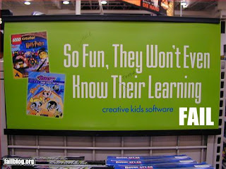
Just a quick grammar fail for this week's post.

"I think the art supplements the pictures and does not confuse the text." That is SO important in design! I knew it was important, but I didn't know how important until reading the material for this week. Pictures should demand attention but not confuse the text.
ReplyDelete